
Family Circle Magazine: Editorial Design
Selected work from various Family Circle issues.
Family Circle Magazine: Editorial Design
Selected editorial work from various issues and magazine sections.
Tools Used: Adobe InDesign
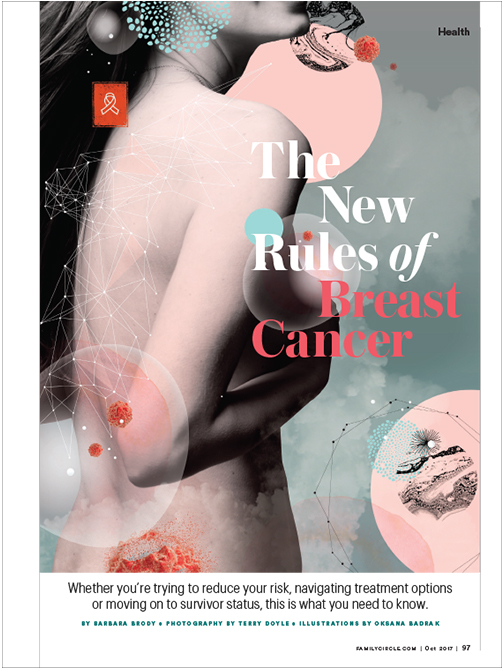
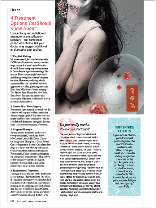
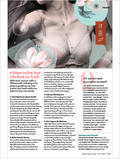
The New Rules of Breast Cancer
Creative Direction and Layout
Illustrations by Oksana Barak
For this story the art department wanted to break away from the typical portrayal of breast cancer stories seen in women’s magazines (i.e.- imagery of baloons, melons, pink ribbons, etc.). While we could not escape breasts themselves, I had pitched the idea to go the photo illustrative approach. This approach took a delicate topic and made it visually stunning and inviting to read from start to finish.
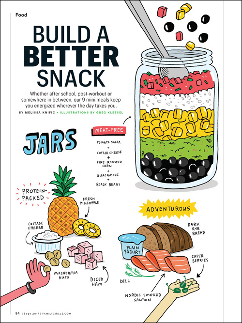
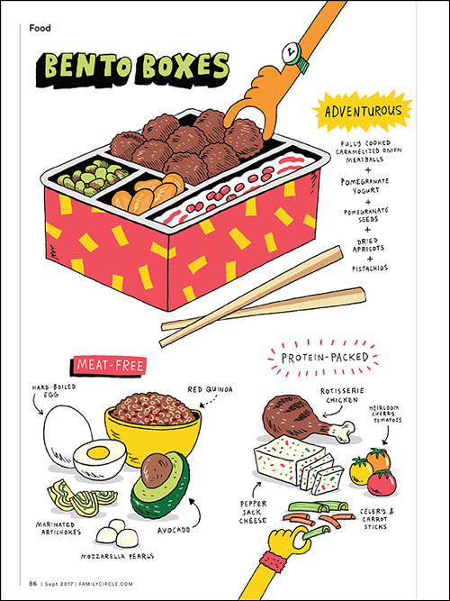
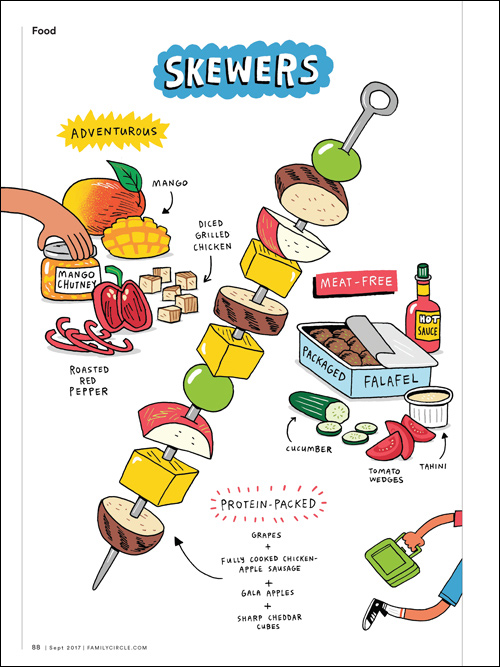
Build A Better Snack
Creative Direction, Art Direction, and Layout
Illustrations by Greg Kletsel
Illustration for an entire food feature was an unconventional creative choice for the magazine at the time, but the opportunity presented itself with a full story dedicated to teen snacks for the splashy September “Back to School” issue. I chose to work with Greg Kletsel for this story because his illustration style has a quirky, yet accessible feel that makes sophisticated snacks approachable for both parents and teens.
Many recipe “stories” are chock-full of long written directions and ingredients for prepping, baking, grilling, etc.. When this is the case, photos are really helpful for home cooking and baking so that you know if you’re making the recipe correctly. However, these recipes contain short lists of ingredients with no directions because of their simplicity and snack-ability. Therefore, we thought it would be fun to dedicate these pages to full illustration.
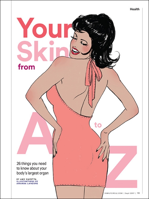
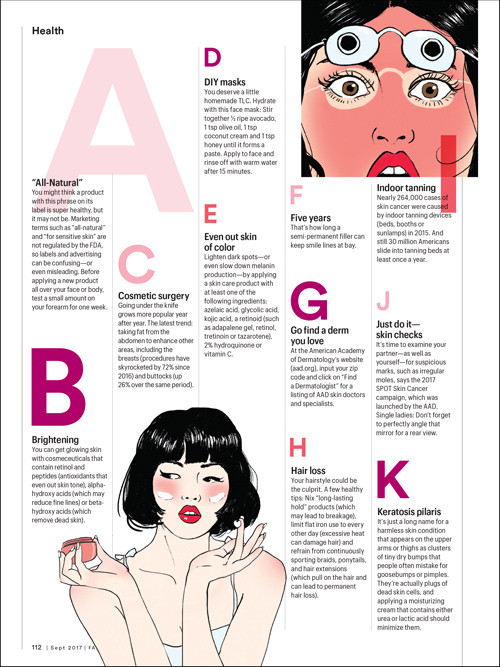
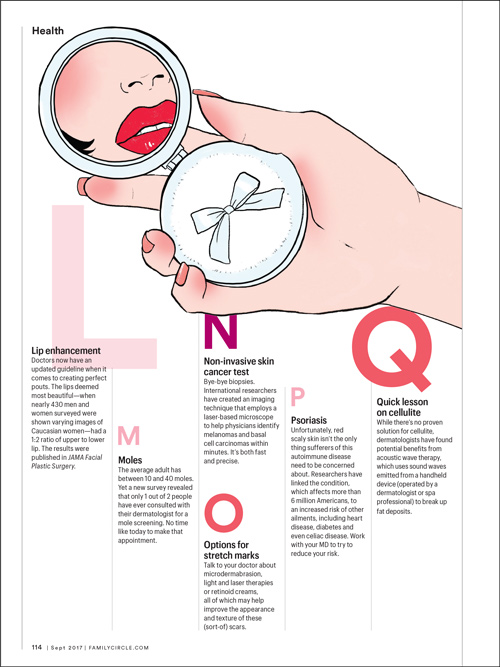
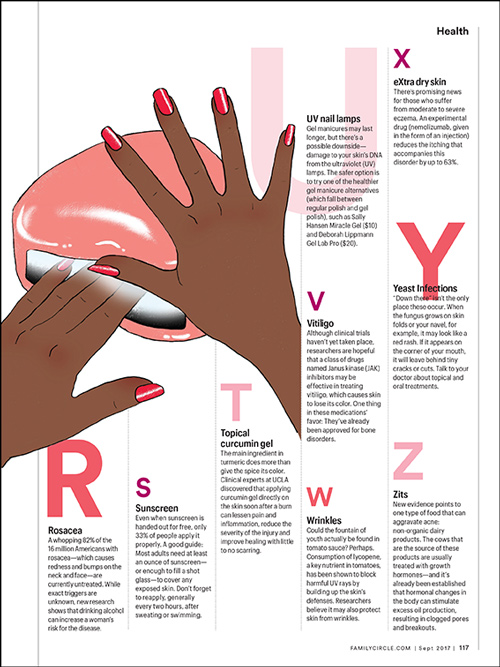
Your Skin From A to Z
Creative Direction, Art Direction and Layout
Illustrations by Amanda Lanzone
To appeal to more millennial subscribers, the art team was looking to push the boundaries of the Family Circle brand for this magazine issue. This edgy approach to illustration and layout was a way to break out of our normal conventions for a health story. Why not show a bit of skin when it’s a skin story?
Amanda Lanzone’s illustration style lends playfulness to this feature packed with important information about skin health. I played with the scale of type throughout the layout to complement the illustrations to keep the reader engaged.
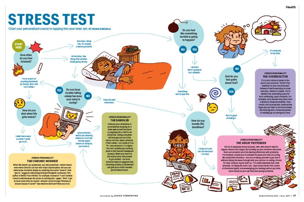
Stress Test
Creative Direction, Art Direction, and Layout Design
Illustrations by Jackie Ferrentino
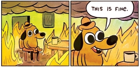
Since the flowchart was about stress, the popular Meme “This Is Fine” (shown to the right) came to mind while developing a creative direction for this layout.
I worked closely with Jackie to have her channel a similar energy in her illustrations. This comical approach made an article about stress fun, relatable, and current to memetic culture.
Below: The Inspiration