
Einsidler Management, Inc. Rebrand Strategy
Art Direction, Brand Strategy, Graphic Design, and Communication Strategy
Tools Used: Sketchbook and Adobe Creative Suite
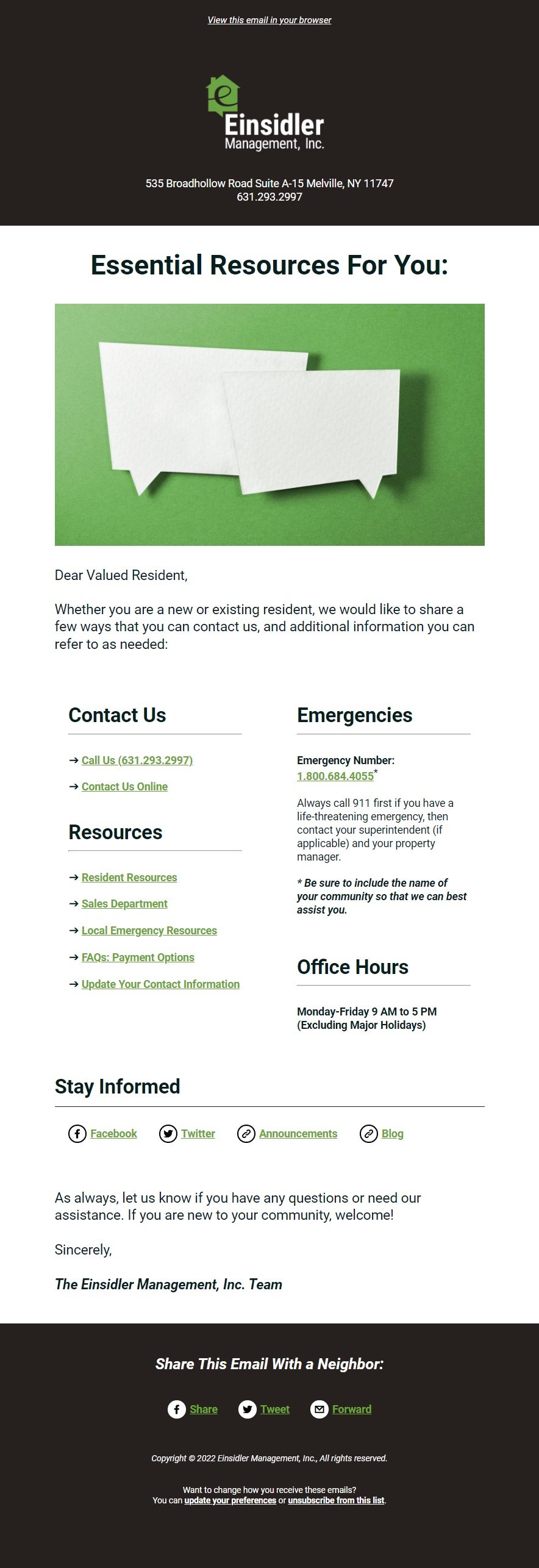
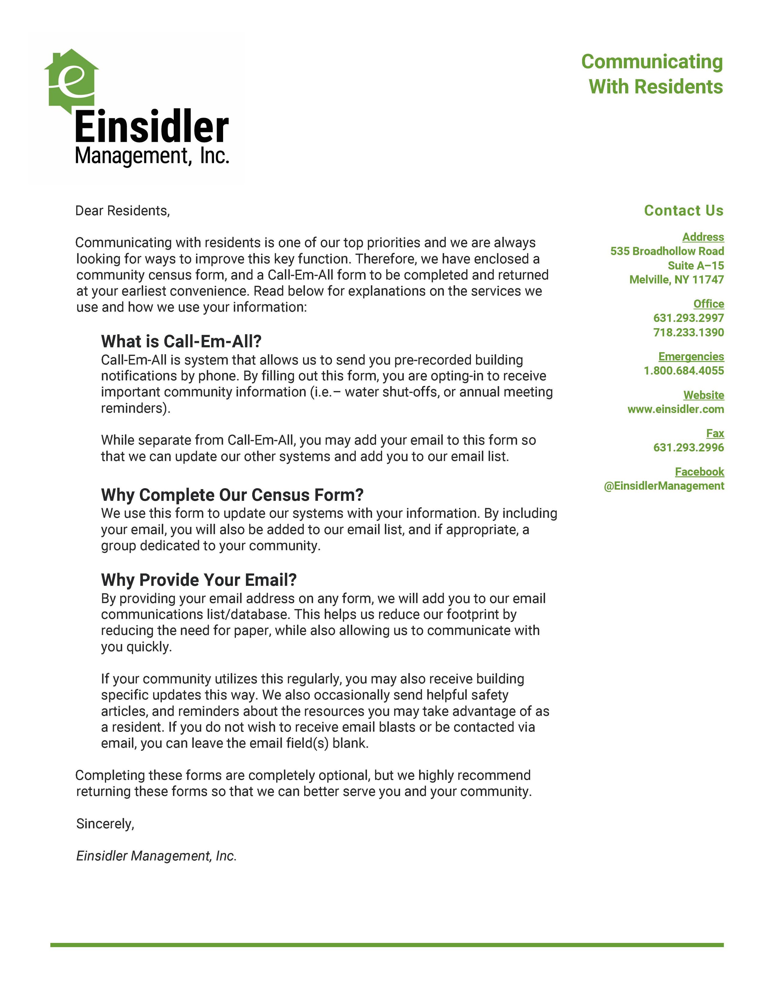
About the Company
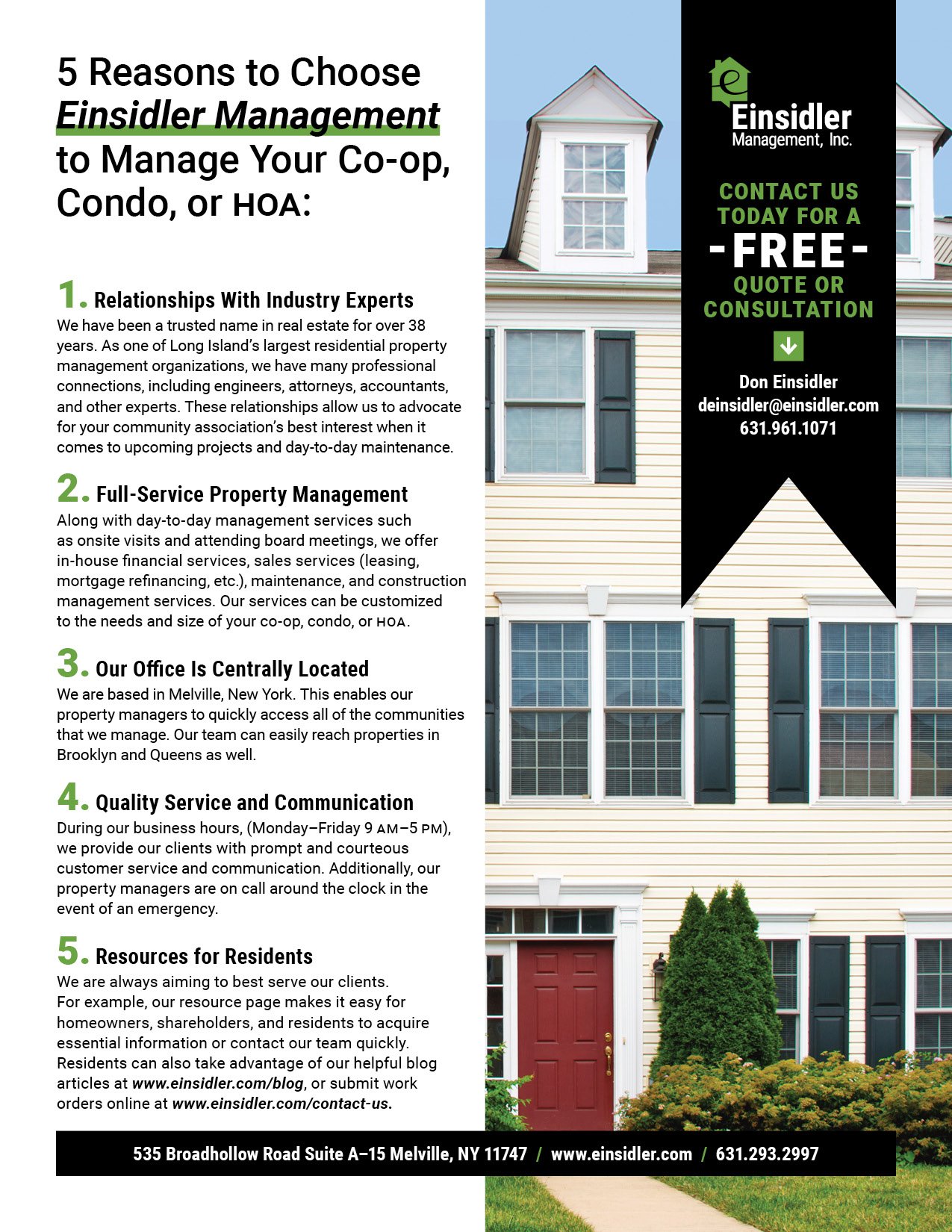
Einsidler Management, Inc. is a family-owned and operated Residential Property Management firm that is based in New York. They serve cooperatives, condominiums, and Homeowners Associations in Long Island, Brooklyn, and Queens.
Board members, residents, shareholders, and residents rely on the expertise of property managers and other professionals who oversee everything from the financial to the physical maintenance of their building or community.
Vintage Family Inspiration
During initial branding research and development, I discovered a real estate brochure that was developed by my Grandfather and great-uncle when they were builders in Queens, New York (which is currently archived in the Columbia University Libraries’ New York State Real Estate Brochure collection).

Founders Fred (left) and Mel (right) Einsidler in1955.

Image Source:
Trylon Realty. Queens Fair Homes, 71 Street And Long Island Expressway. [192--197-]. Pamphlet. New York Real Estate Brochure Collection, Avery Architectural & Fine Arts Library, Columbia University. Columbia Digital Library Collections. 22 Jul 2023
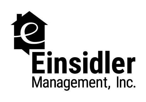
The Logo
Before
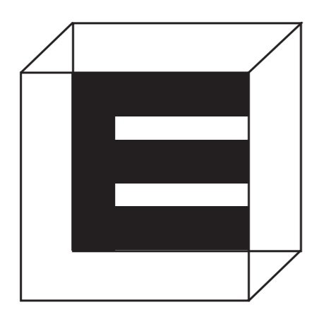
The company has been an established name throughout Long Island communities for over 40 years. However, the branding was in need of an update to reflect forward-thinking, trust, and expertise. A subtle “E” can be found in the original logo.
After
The playfulness of the home iconography, combined with the pronounced script “e” communicate that the company is a trusted expert in the field without coming off as unfriendly or inhuman. Additionally, the “chat” bubble symbolizes the importance of clear communication and quality service needed in the property management industry.

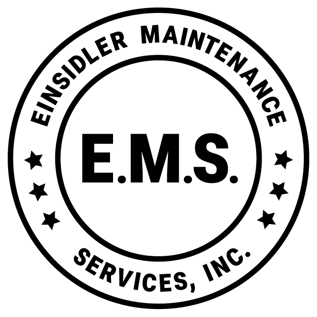
Einsidler Maintenance Services
Einsidler Management, Inc. launched an affiliated business that offers maintenance and repair services to co-ops, condos, and HOAs. The logo stays consistent to the main logo through color and typeface, yet the seal provides a separation between the two businesses.

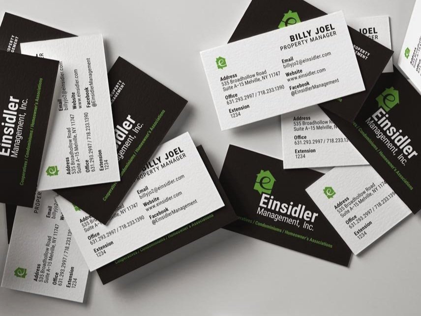
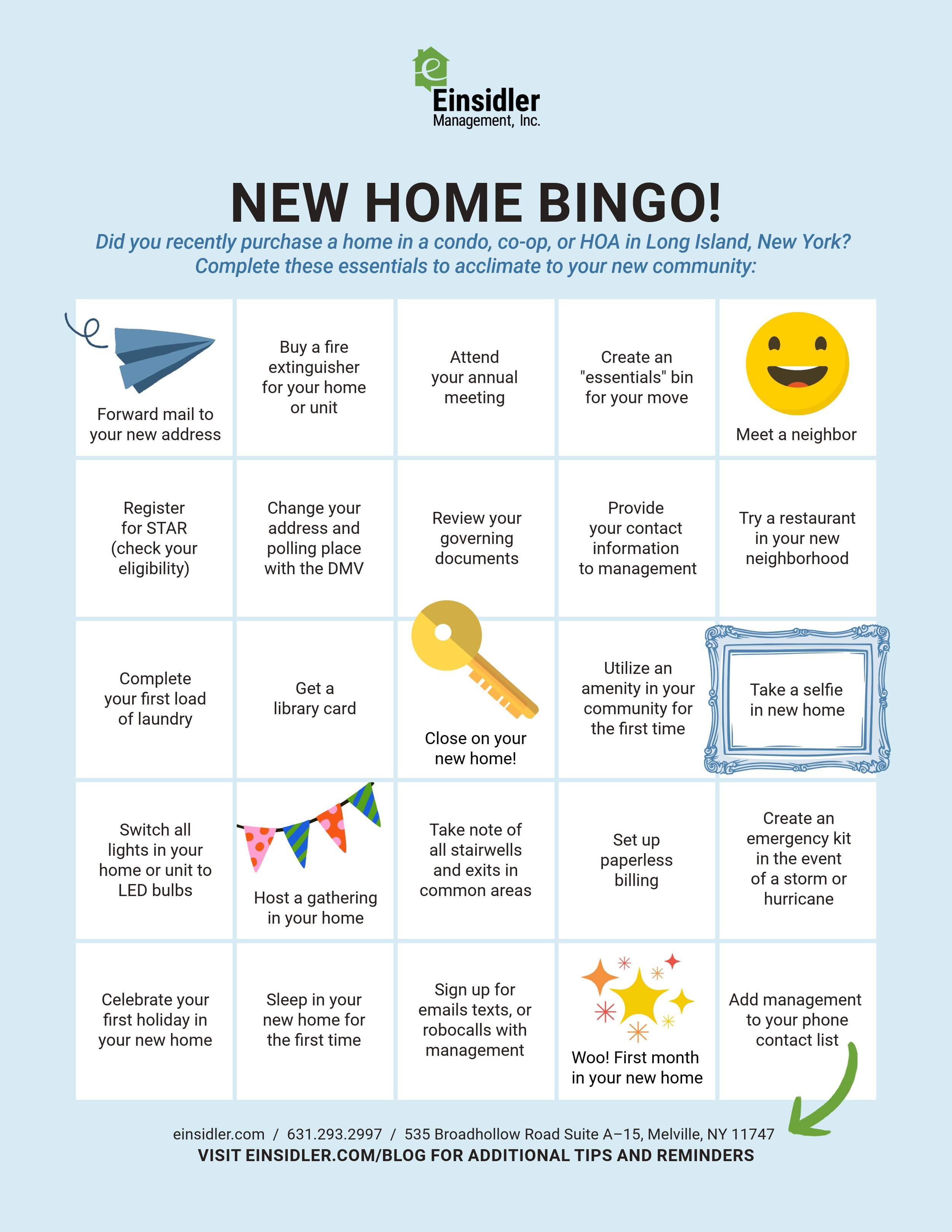
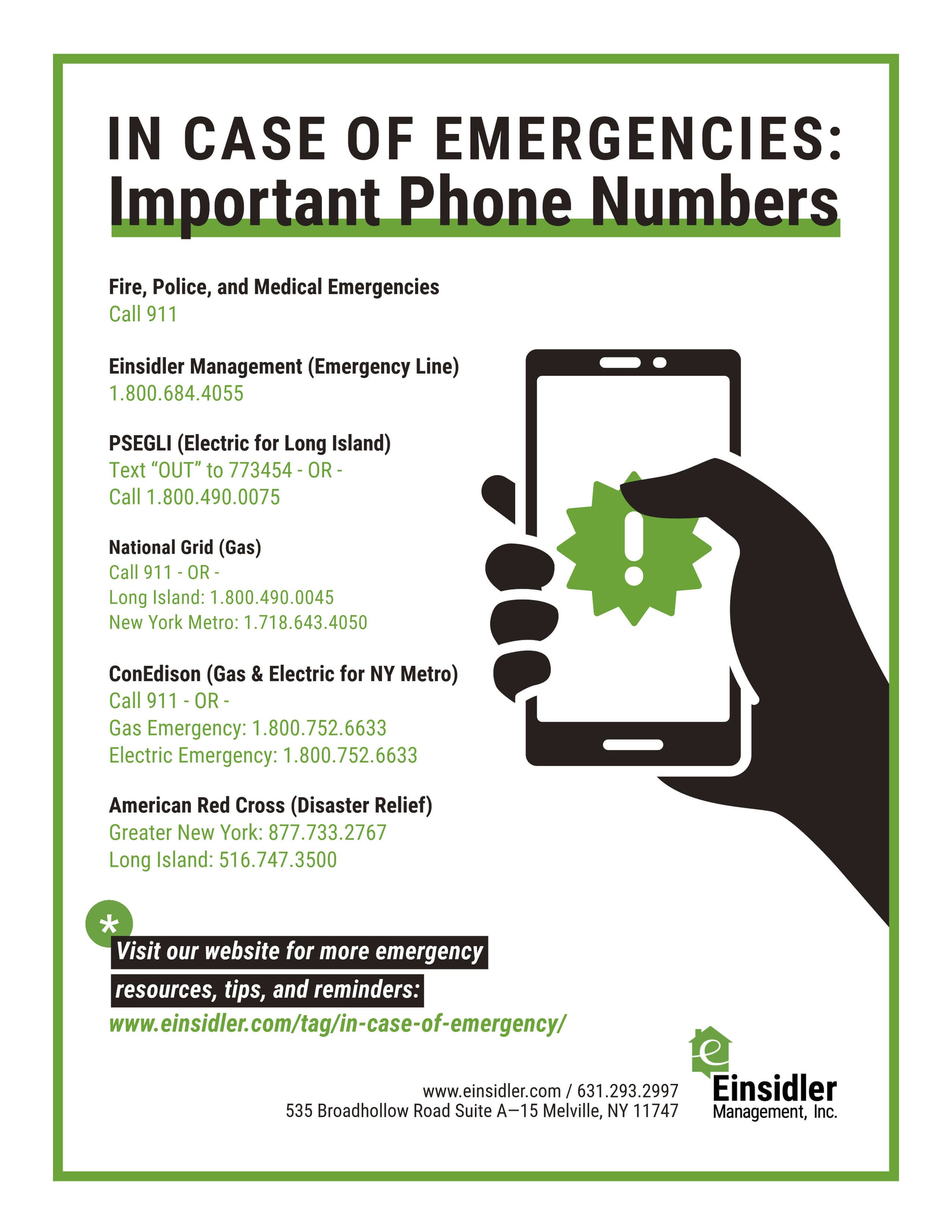
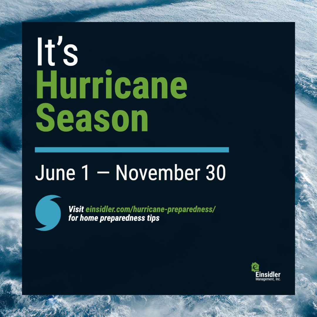
Branding Material Examples


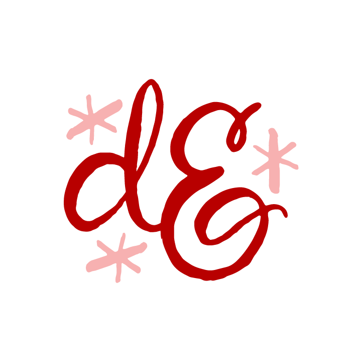
Mark Exploration
I explored various iterations of the visual concept where the home or building is juxtaposed with the letter E. I wanted a final logo that made the E more visually prominent than in the previous logo.
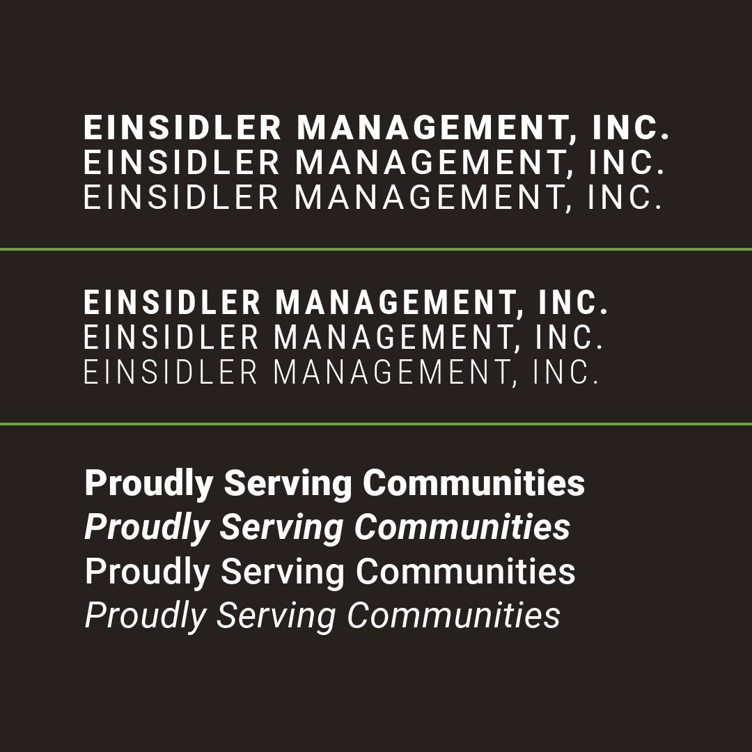
Typeface Selection
Roboto and Roboto Condensed offer a visual language that conveys trust and professionalism without being too stiff or unfriendly. These qualities are important for an industry that requires communication, clarity, and quality customer service.
Below: Final Color Pallette

Below: Explored Color Palettes


Color Palette
I had explored color palettes that were completely different than the original “moss” green in the former logo, but ended up choosing a palette that offered a fresh update to the existing palette. This decision modernized the branding without completely departing from the visual identity that people are familiar with.